Choosing a color palette can feel like the moment everything else hinges on, which is exactly why so many people freeze at the paint aisle. The good news is that a palette isn't something you have to invent from nothing. It's already hiding in the things you're drawn to, waiting for you to notice the pattern.
Start with something you love#
The hardest way to choose colors is to stand in front of a wall of paint chips and pick. There's no anchor, no reason for one swatch over another, and every option starts to look the same. So don't start there. Start with something you already own and genuinely love — a rug, a painting, a favorite scarf, a photograph from a trip that still makes you smile.
Look closely at what's in it. A patterned rug or a piece of art has usually done the hard work for you: a designer or artist already chose colors that sing together. Pull those colors out one by one. You'll often find a dominant tone, a softer companion, and one or two little sparks of something brighter. That's a palette, fully formed, and it came with built-in proof that the combination works.
This approach also keeps your home personal. Colors chosen from things you love carry a little of your story, so the finished room feels like yours rather than like a page from a catalog. If nothing in your home jumps out, look outward — a landscape you love, a season you feel most yourself in, the colors of a place you'd return to in a heartbeat. The palette is in there.
Give every color a job#
Once you have a handful of colors, the temptation is to use them all equally. Resist it. A room where everything competes for attention feels busy and tiring, no matter how lovely the individual colors are. The trick is hierarchy: let one color do most of the work, let one or two support it, and save the boldest for small, deliberate moments.
A familiar way to think about this is a rough split — a generous base color across the big surfaces, a secondary color for upholstery and curtains, and a small dose of an accent for cushions, art, and objects. You don't need to measure anything. The point is simply that some colors lead and others follow. When the base is calm and the accent is the spark, your eye knows where to rest and where to land.
A palette isn't a list of colors you use in equal amounts. It's a cast of characters, each with a different size of role to play.
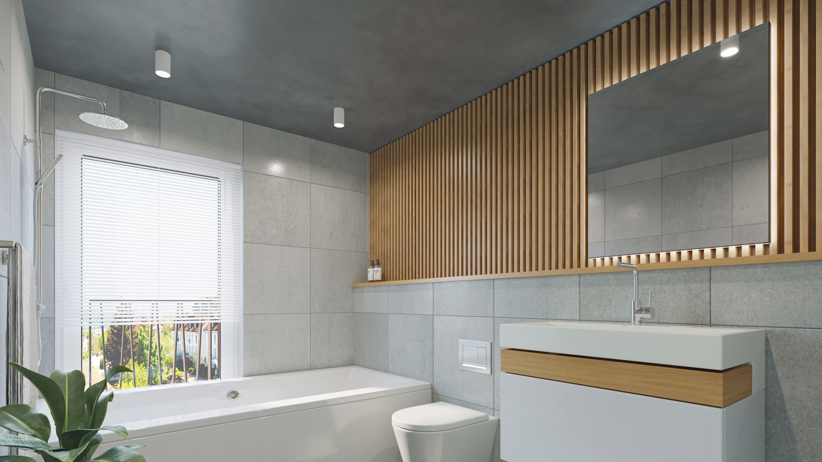
Your boldest, most saturated colors almost always work best in small doses. A deep teal feels gorgeous as a chair or a stack of cushions and overwhelming as four walls. Letting a vivid color stay a guest rather than the host means you'll still love it a year from now, and it's far easier to swap a cushion than to repaint a room.
Let colors flow between rooms#
A home feels considered when it reads as a whole, not as a series of unrelated rooms slammed together. You don't need to paint everything the same color to get that — in fact, please don't. You just need a few threads that travel from space to space, quietly tying things together as you move through.
The simplest thread is a shared neutral. If the same soft white or warm greige appears on trim, ceilings, or a main wall throughout the home, every room already has something in common before you add a single accent. From that calm foundation, each room can take on its own personality: a moodier study, a sunnier kitchen, a restful bedroom. They'll still feel related because they're speaking the same underlying language.
You can also let an accent color migrate. A blue that's a feature wall in one room might reappear as a vase in the hallway and a throw in the next room, growing quieter as it travels. This kind of repetition is subtle, but your eye notices the rhythm even when your mind doesn't. The effect is a home that flows — calm and cohesive without ever feeling matchy or monotonous.
Test before you trust#
Color is a notorious shape-shifter. The swatch that looked perfect in the store can turn cold, muddy, or oddly green once it's on your wall, because the light in your home is nothing like the light under fluorescent tubes. This is why the single most useful habit in choosing color is to test it where it'll actually live.
Paint a generous patch — bigger than you think you need — or tape up a large sample, and then live with it. Look at it in morning light, in flat afternoon light, and under your lamps at night. A north-facing room will pull colors cooler, while warm evening light can make a crisp white glow golden. The color that's beautiful in all of those moments is the one to trust.
A few small habits make testing more reliable:
- View samples against a white card so the existing wall color doesn't fool your eye.
- Check colors next to the furniture and textiles they'll share the room with.
- Give yourself a day or two to decide rather than judging in the first five minutes.
None of this is about being fussy. It's about respecting how much light shapes color, and saving yourself the quiet disappointment of a hue that looked right for ten minutes and wrong forever after.
Trust the palette you've built#
A color palette isn't a rule you have to obey for the rest of your time in the house. It's a starting point — a thoughtful set of colors that work together and give you confidence as you make a hundred small decisions, from the sofa to the throw to the picture frame on the shelf. With an anchor you love, a clear sense of which colors lead and which follow, and a few threads carrying through the rooms, those decisions get easier and the results get more cohesive.
So gather the things you love, pull out the colors hiding inside them, and let those guide you. Test before you commit, leave room for the bold notes to stay rare and special, and let a few shared tones tie it all together. Do that, and you won't just have a palette — you'll have a home that feels unmistakably, comfortably yours.