Mixing patterns is the move that makes people nervous, and it's also the one that gives a room real personality. A space that's all solids can feel a little flat and safe, while a room where florals, stripes, and geometrics live happily together feels collected, layered, and alive. The trick isn't taste you're born with — it's a handful of simple ideas anyone can use.
Tie everything together with color#
The secret that makes wildly different patterns get along is a shared color thread. When two or three prints have a color in common, the eye reads them as belonging to the same family, even if their motifs couldn't be more different. A bold floral, a tidy stripe, and a small geometric look chaotic side by side — until they all share the same warm terracotta, or the same soft blue, and suddenly the whole grouping clicks into place.
This is the most forgiving way to start, because it lets you be adventurous with the patterns themselves while keeping a safety net underneath. Pick a palette of two or three colors you love, then choose patterns that each pull from that same set of tones. The prints don't have to match — in fact they shouldn't — they just need to speak the same color language. Once you see how reliably this works, the fear of clashing mostly evaporates.
You can lean on an existing piece to set that palette for you. A patterned rug, a favorite throw, or a piece of art is a ready-made color scheme, with several tones already in conversation. Pull your other patterns from those colors and you've borrowed a designer's eye without doing the hard part yourself. The room ends up feeling intentional because, underneath all the variety, one quiet palette is holding it together.
Play with scale#
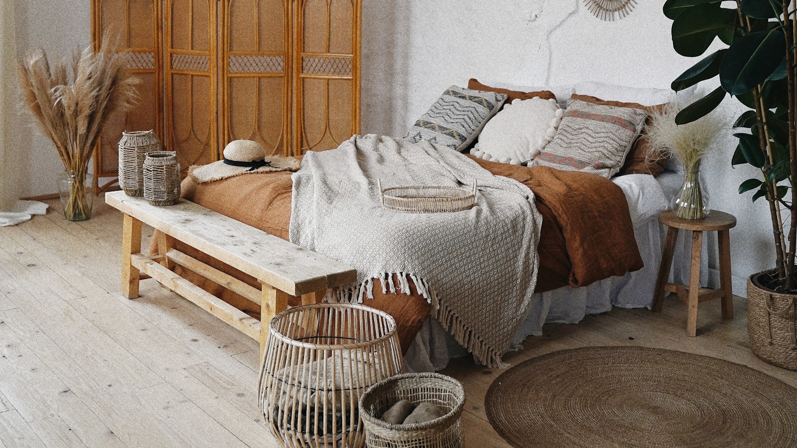
Once color is handling the harmony, scale handles the interest — and getting it right is what keeps patterns from fighting. The problem with combining several prints of the same size is that they all shout at the same volume, and the eye doesn't know where to land. The fix is to vary the scale deliberately: pair a large, sprawling pattern with a medium one and a small, tight one. That range gives the grouping a natural hierarchy, a sense of which print leads and which ones support.
Think of it like a conversation where everyone takes turns rather than talking over each other. A big, dramatic floral can be the loud, confident voice. A medium stripe or check is the steady middle. A tiny dot or fine geometric is the quiet detail you notice last. Because each pattern occupies a different scale, they read as complementary instead of competitive, and the eye moves pleasantly between them rather than getting stuck.
When patterns clash, the problem is usually that they're all the same size — not that they're too different.
This scale trick is wonderfully flexible. It works on a sofa stacked with mixed cushions, on a bed dressed in layered linens, or across a whole room where curtains, upholstery, and a rug all carry pattern. Wherever you're combining prints, ask yourself whether you've got a clear large, medium, and small in the mix. If everything's the same scale, shake it up. That single adjustment fixes more "off" pattern combinations than anything else.
Vary the type, and let solids breathe#
Beyond color and scale, variety of pattern type keeps a mix feeling rich rather than repetitive. Florals, stripes, checks, geometrics, dots, and organic textures each have a different rhythm, and combining different families is far more interesting than stacking up three versions of the same idea. A room with three florals can feel busy and a touch monotonous; swap one floral for a stripe and another for a geometric, and the same colors suddenly feel lively and curated.
A simple way to build a confident mix is to choose one pattern of each character:
- One large organic print, like a sprawling floral or leafy motif, to bring softness and movement
- One structured linear pattern, like a stripe or check, to add crispness and order
- One small repeating pattern, like a dot or fine geometric, to fill in and tie the others together
That little formula isn't a rule so much as a reliable starting point — once you trust your eye, you'll break it happily. The point is contrast of character. Soft against structured, sprawling against tight, organic against geometric: those differences are what make a pattern mix feel collected over time rather than bought in a single matching set.
Just as important as the patterns are the spaces between them. A room that's pattern from floor to ceiling gives the eye nowhere to rest, and even the loveliest prints start to feel overwhelming. Solids are the pause that makes the patterns sing. A plain sofa, a solid wall, a couple of unpatterned cushions, an expanse of bare floor — these quiet moments let each print stand out instead of blurring into the next. Aim for a balance where pattern feels like the highlight and solids feel like the breathing room around it.
If you're nervous, start small and grow your confidence. A few mixed cushions on a solid sofa is a low-stakes experiment, easy to rearrange or retire if it isn't working. Live with it, see how the combination feels in your light and your room, then build out from there once you trust it. Pattern mixing is far more forgiving than it looks, and the small scale lets you learn what you love without committing the whole room.
Mixing patterns rewards a playful, experimental spirit more than any strict set of rules. Share a color thread, vary your scales, combine different families of print, and leave room for solids to breathe — and you'll find that prints you'd never have dared to pair suddenly look like they were always meant to be together. That collected, layered, lived-in look isn't luck or expensive taste. It's just these few quiet ideas, used with a little courage and a lot of enjoyment.