Color is the most powerful tool you have, and it's also free to imagine. Before you spend a cent, you can picture a flat beige room turned warm and alive, or a chaotic space calmed by a single quieter shade. Color does that work — it changes how a room feels the moment you walk in, often before you can say why.
Color sets the mood first#
Walk into any room and your body reacts to the color before your mind catches up. A space wrapped in soft, warm tones feels like an exhale. A room of cool blues and greens feels calm and a little crisp. A jolt of bright, saturated color feels energetic, sociable, awake. None of this is mystical — it's just how we respond to color, and you can use it on purpose.
So before choosing a single shade, decide how you want a room to feel. A bedroom usually wants to feel restful, which points toward softer, lower-contrast colors that let your eye settle. A kitchen or a gathering space can take more energy, so brighter or warmer notes earn their place. A home office might want a color that helps you focus without putting you to sleep. Start with the feeling and the colors follow, rather than picking a color you like in the abstract and hoping the mood works out.
This is also why the same color can be right in one room and wrong in another. There's no universally "good" or "bad" color — only colors that suit, or fight, the mood you're after. When a color choice feels off, the real question usually isn't whether you like the hue. It's whether it matches what you want the room to do for you.
Understand warm and cool#
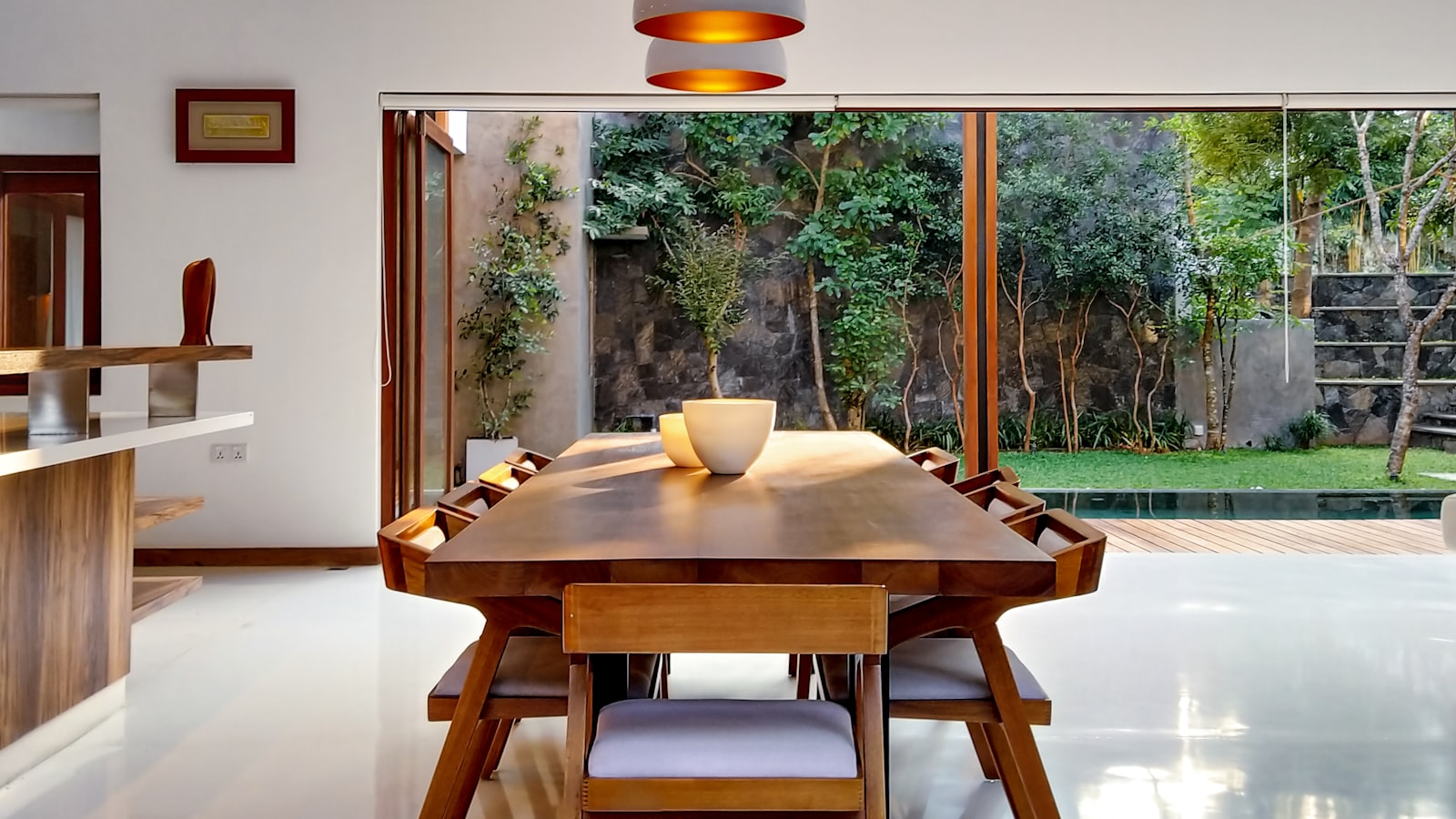
One of the most useful ideas in color is also one of the simplest: colors lean warm or cool, and that lean changes how a space behaves. Warm colors — reds, oranges, yellows, and warm-leaning neutrals — feel cozy and tend to make a large or sparse room feel more intimate and enclosed. Cool colors — blues, greens, and crisp grays — feel calm and airy, and can make a small room feel a touch more open and serene.
You can use this like a dial. A big, echoey room that never feels cozy might be asking for warmer tones to draw the walls in and soften the space. A small, slightly stuffy room can breathe with cooler, lighter colors. Even within a single color family, the temperature matters: a warm white feels welcoming where a cool white feels clean and a little clinical. Noticing whether a color is pulling warm or cool is half the battle, and it explains a lot of the times a room "just feels off."
Color isn't only about which hue you choose. It's about temperature, and temperature quietly decides whether a room feels like a hug or a breath of fresh air.
Most rooms feel best with a clear lean in one direction, plus a small counterweight. An overwhelmingly cool room can feel a little cold until you add a warm wood tone or a hit of amber; a very warm room can settle down with one cool accent. You're not balancing them equally — you're choosing a dominant temperature and using its opposite as a gentle correction.
Repeat color so it belongs#
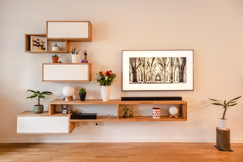
A color used only once in a room can look like an accident — a lone red cushion stranded on a blue sofa reads as random rather than designed. The fix is wonderfully simple: repeat it. When a color appears a few times across a space, your eye connects the dots and reads the whole thing as intentional, considered, pulled together.
This is one of the easiest principles to apply and one of the most satisfying. Love a particular green? Let it show up in a plant, a stack of books, a piece of art, and a small ceramic dish. Now the green feels woven through the room instead of dropped into it. The repetitions don't need to match exactly — variations on a color often look richer than identical ones — they just need to echo each other enough to feel connected.
Spreading a color around the room also balances it visually. A bold color clustered in one corner pulls all the weight to that side, while the same color sprinkled across the space feels even and calm. As you place accents, glance at the room as a whole and ask whether one area is hogging the color. A small adjustment — moving a cushion, relocating a vase — is usually all it takes to settle the balance.
Be braver than you think#
Many of us play it too safe with color, defaulting to neutrals everywhere because they feel like the responsible choice. Neutrals are wonderful, but a home with no color anywhere can feel a little cautious, like it's holding its breath. You don't have to paint every wall a daring shade to bring a room to life — you just have to be a little braver in a few well-chosen places.
The lowest-risk way to grow bolder is through things that are easy to change: cushions, throws, art, lamps, a single piece of painted furniture. If a bright color in a small dose makes you nervous, that's actually a sign it'll bring energy. Try it, live with it, and notice that the world keeps turning. The next bold choice always feels easier.
Small and transitional spaces are the perfect place to experiment. A powder room, an entryway, the inside of a cabinet, a hallway you pass through quickly — these are low-stakes rooms where a strong color delights rather than overwhelms, because you're not living in them all day. A jewel-toned little bathroom or a moody, deep entry can become the most memorable corner of your home, and it gives you the confidence to be braver elsewhere.
Let color work for you#
Color rewards attention more than expertise. You don't need to memorize a wheel or follow anyone's rules — you need to notice how colors make you feel, choose a temperature that suits each room, repeat your favorites enough that they read as intentional, and find a little courage in the easy-to-change places. Do those things and color stops being intimidating and becomes the most enjoyable, expressive part of decorating.
The most colorful rooms aren't the busiest ones; they're the ones where every color is there on purpose, doing a job, telling a small part of your story. Start with the feeling you want, build the color around it, and trust that your own eye knows more than you give it credit for. The room you're imagining is closer than you think, and color is how you'll get there.